fitzcarraldo editions
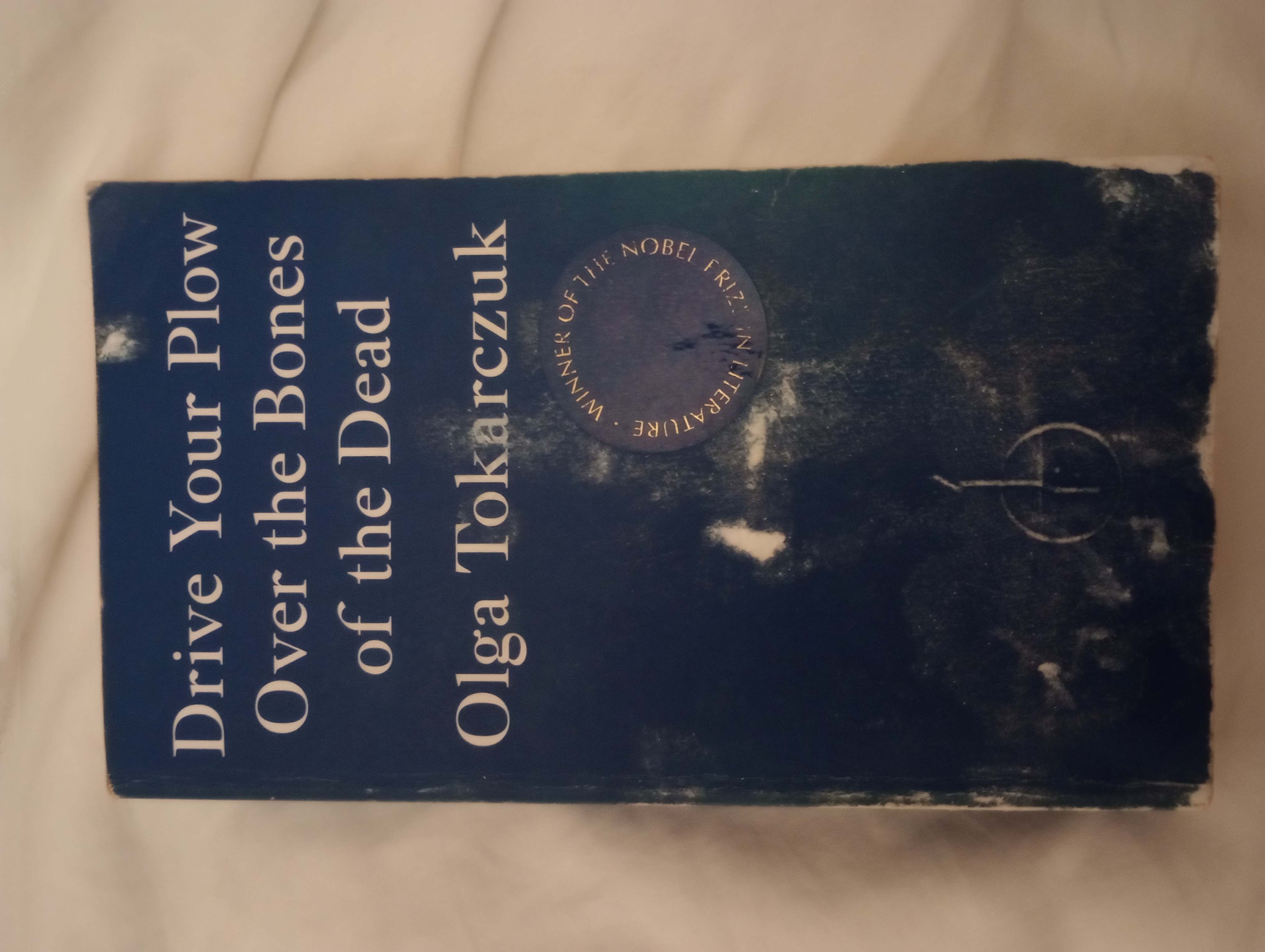
one of my latest niche-ish interests has been the british book publisher fitzcarraldo editions. their main selling point is the simplicity of their book covers: each one is near-identical, with their fiction books consisting of a plain cover in the shade international klein blue (yes, the paint from that infamous modern art piece lol) and the title and author's name in white in their own custom font, fitzcarraldo. non-fiction books have the colour scheme flipped. i love how cohesive all the books look, and the simplicity is striking when compared to most modern designs.
the first (and only, unfortunately) fitzcarraldo book i own is drive your plow over the bones of the dead by olga tokarczuk, which i very much enjoyed. it was one of the first translated books i ever read and was a really nice introduction to more diverse literature. i've had it for about a year now and it's sadly gotten a bit water damaged, although i guess it adds a kind of unique charm? maybe i'm just in denial of how upset it made me.

(my poor baby.)

(my poor baby.)